August 2026
Graphic Standards

A different
degree of
thinking
It’s a slogan that has defined one-eighty’s unique approach to business from the beginning. But what does it really mean? What difference does one-eighty stand for?
Every society has its visionaries, its radicals and artists. People who see and think about the world differently. Dissenters who pursue the art of the possible and, in doing so, expand the sphere of the achievable.
When it comes to permitting major development projects, a different degree of thinking is more than just one-eighty’s rallying cry. It’s a beacon of hope for proponents, and our response to their frequent lament – ‘there’s got to be a better way!’
With one-eighty, there is.

Logo & typography usage
Logo clear space
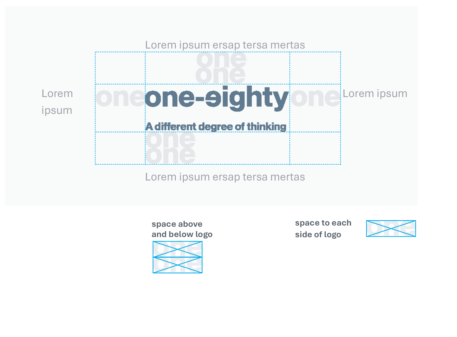
To ensure maximum impact, legibility, and brand recognition, a minimum area of clear space must always surround the one-eighty logo. This protected space helps prevent visual clutter and ensures the logo remains prominent in all applications.
The minimum clear space above and below the logo should equal twice the height of the word mark, measured from the top of the logo and from the bottom of either the word mark or tagline when the tagline is included. On both the left and right sides, the minimum clear space should equal the width of the word “One” within the logo.
The one-eighty logo is the organization’s primary visual identifier and should always be reproduced using approved artwork. The logo must never be altered, stretched, redrawn, embellished, modified, or combined with other graphic elements in a way that compromises its integrity or consistency.
Logo typeface
PP Neue Montreal Bold is the typeface of the logo only. The typeface for one-eighty communications is Aptos.
Aptos is the one-eighty working typeface
Aptos is a precise, contemporary sans serif typeface inspired by mid-20th-century Swiss typography. Its clear-cut stroke endings emphasize order and restraint; the points where curved strokes meet straight strokes are crisp and well defined, which makes the typeface easily readable and reduces visual crowding.

PP Neue Montreal Bold
is the typeface used for the logo
Headlines: Aptos Bold
Subheads: Aptos Bold: Typically 2 points or more
smaller than a headline
Body copy: Aptos Regular: Can be the same
size or smaller than a subhead not larger.

Logo Versions
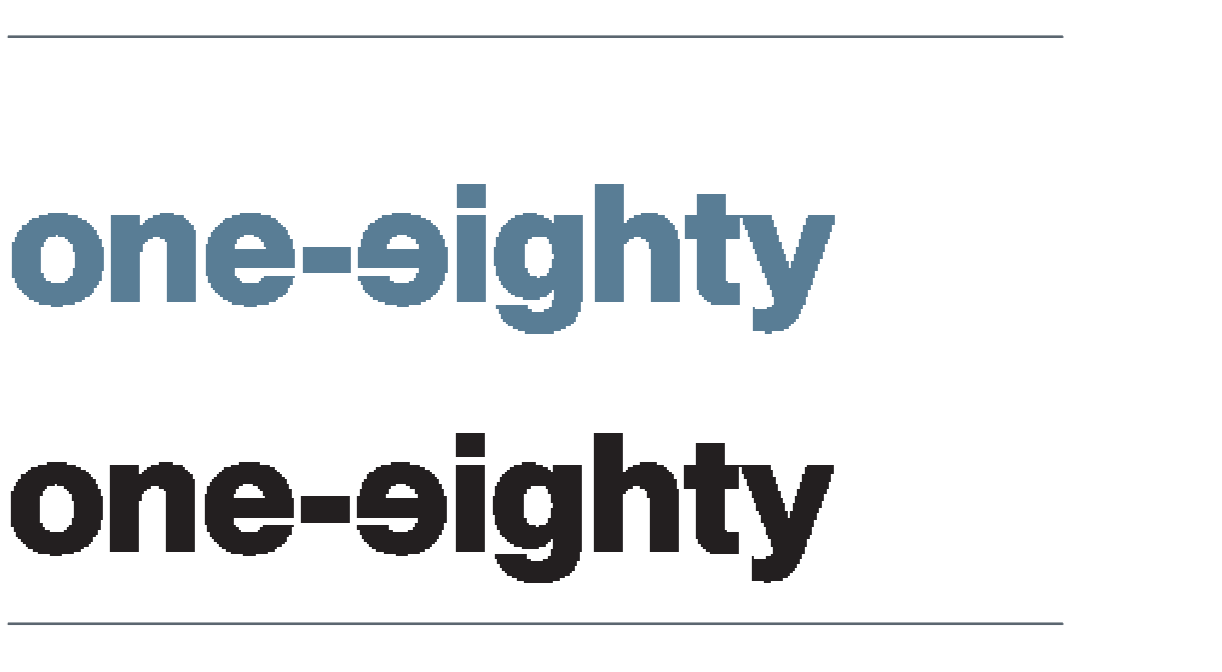
The one-eighty logo may be used in either its blue or black version as the primary brand mark, depending on the application and visual environment. The blue logo reinforces the organization’s core brand identity and creates a distinctive, approachable presence across digital and print materials. The black logo provides contrast and simplicity, Both versions are considered primary logo treatments and may be selected based on the needs of the design.
Color Version
This version is acceptable to use when preferred for a boost of color.
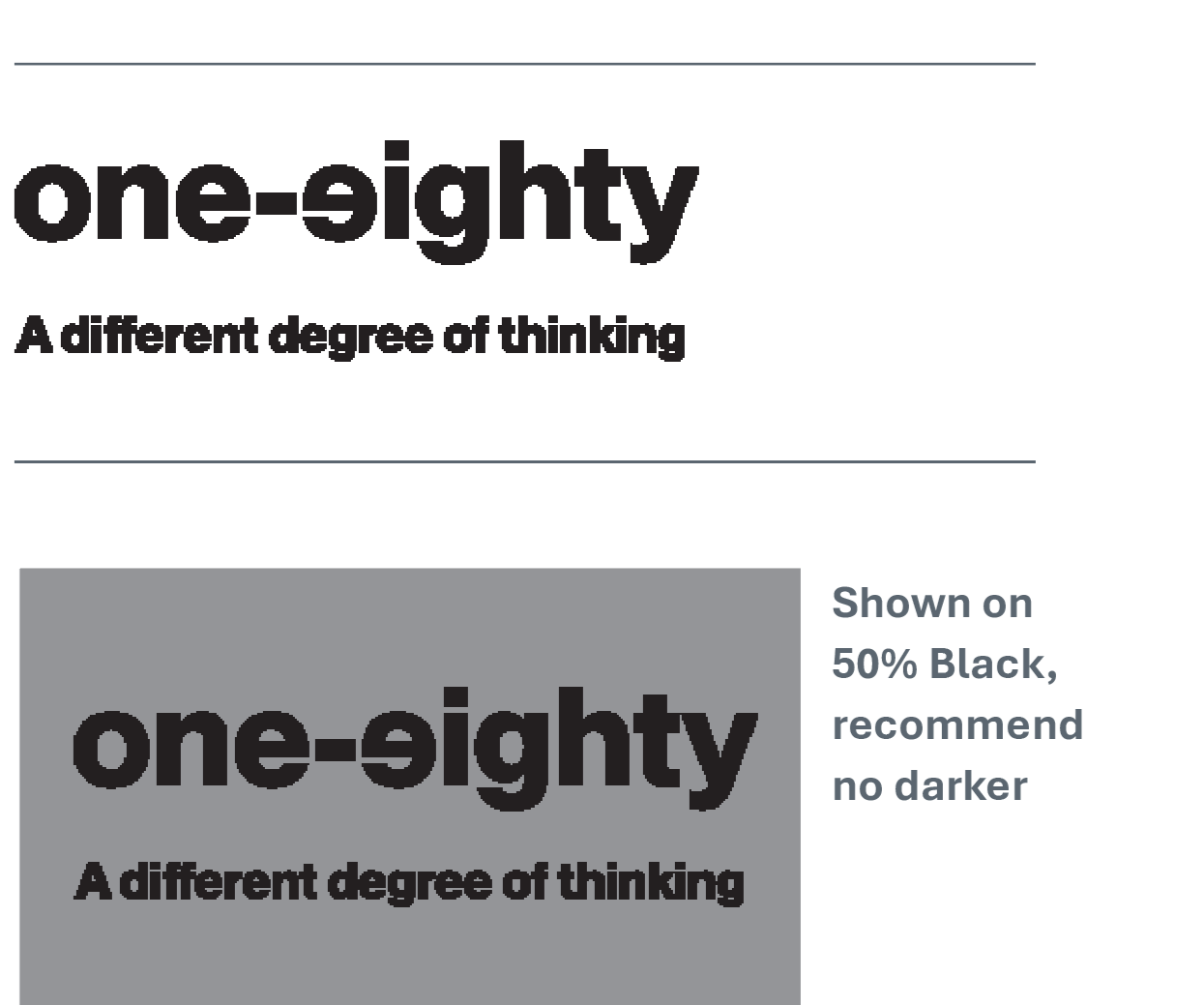
Color and Black only
This Black version can be used on all applications, print or web. It can be used with a light tone behind as well.
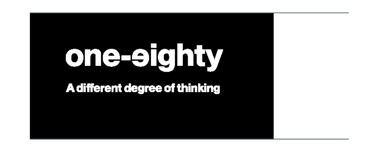
Reverse
This version is to be used on simple one color applications where the background is too dark for the color version.
No tagline
The logo may be used without the tagline when space is limited, at smaller reproduction sizes, or when the brand has already been clearly introduced within the communication. In some applications, the tagline may function more effectively as a headline or supporting message, allowing the logo to appear independently while maintaining strong brand recognition and visual clarity.
Our colors
The One-eighty colors are based on established Pantone colors. When designing and looking for floods of color as backgrounds the Pantone colors attached can be used. When printing the logo digitally or offset, it is setup to print using cmyk, which will keep the process simple. Printing the logo in color is preferable.
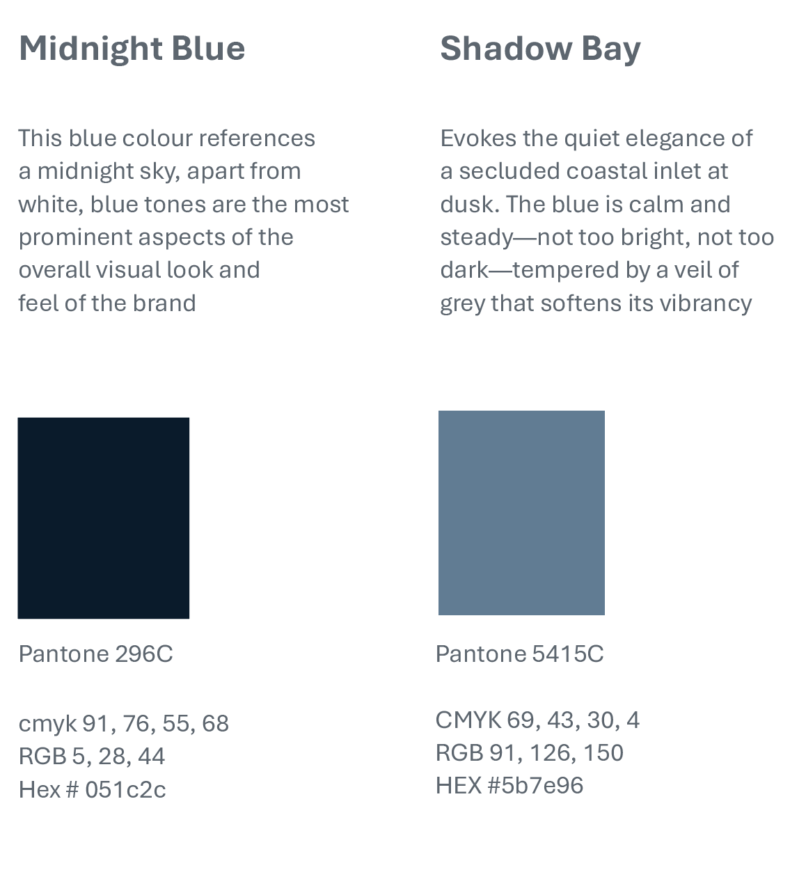
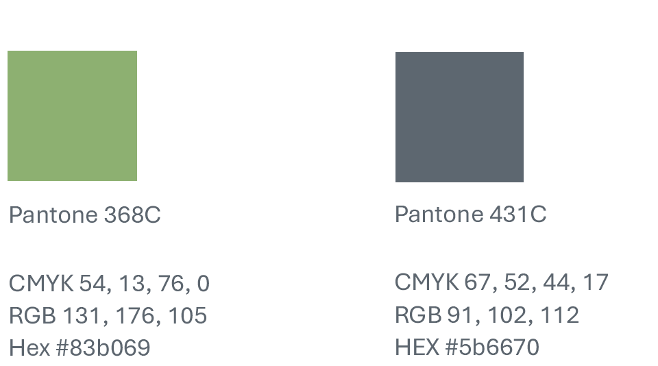
Secondary colors
Secondary colors highlight and compliment the primary color or colors. We suggest to use these colors as “accents” or highlights when needed. They should not be the primary colors of a document or website.

Design examples
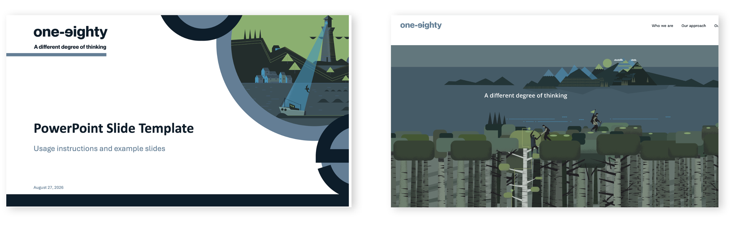
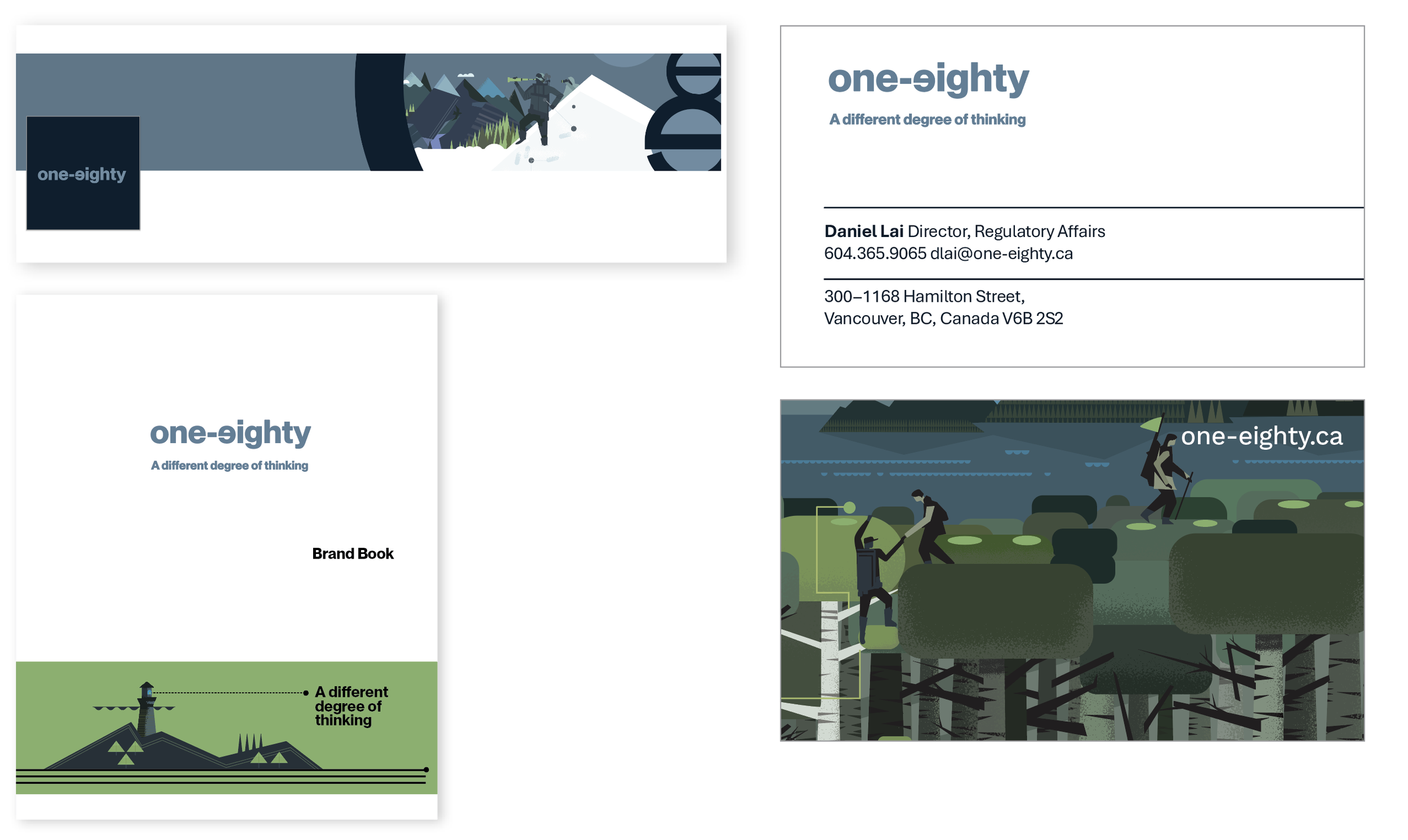
The overall look and feel of the One-Eighty brand is clean, modern, and confident. The visual identity is built primarily around white space, avoiding the use of full color backgrounds. Instead, white backgrounds provide a bright and professional foundation, while Shadow Bay Blue, Midnight Blue, and the secondary colour palette are used as strategic accents to add energy, contrast, and visual interest. The logo can stand alone as a primary graphic element or be used in conjunction with the brand’s illustration style to create a cohesive and recognizable visual presence.

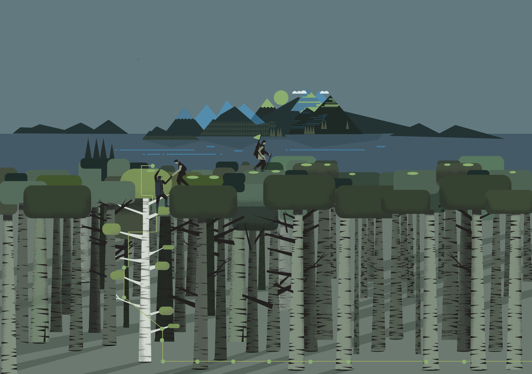
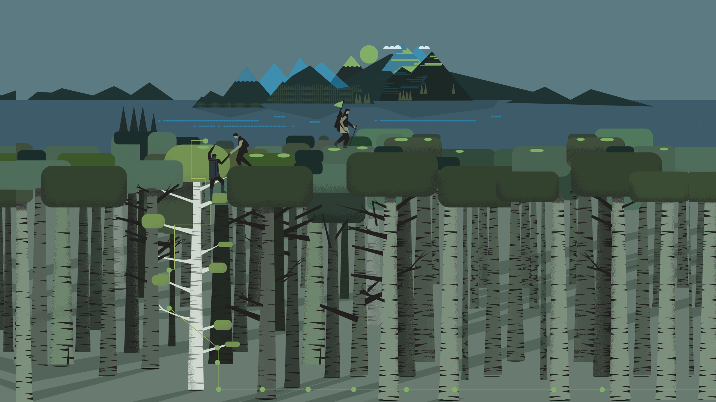
Brand Illustration
When designing with the brand illustrations use them to
enhance layouts not dominate them. They can be used either as full bleed pages with secondary type overlayed or as portions of a longer layout.





Brand icons
Using a set the of icons in One-eighty’s brand literature can significantly enhance clarity, consistency, and emotional engagement. The icons can be used to enhance layouts and be used as section heads. The icons shouldn’t be used as large featured art.
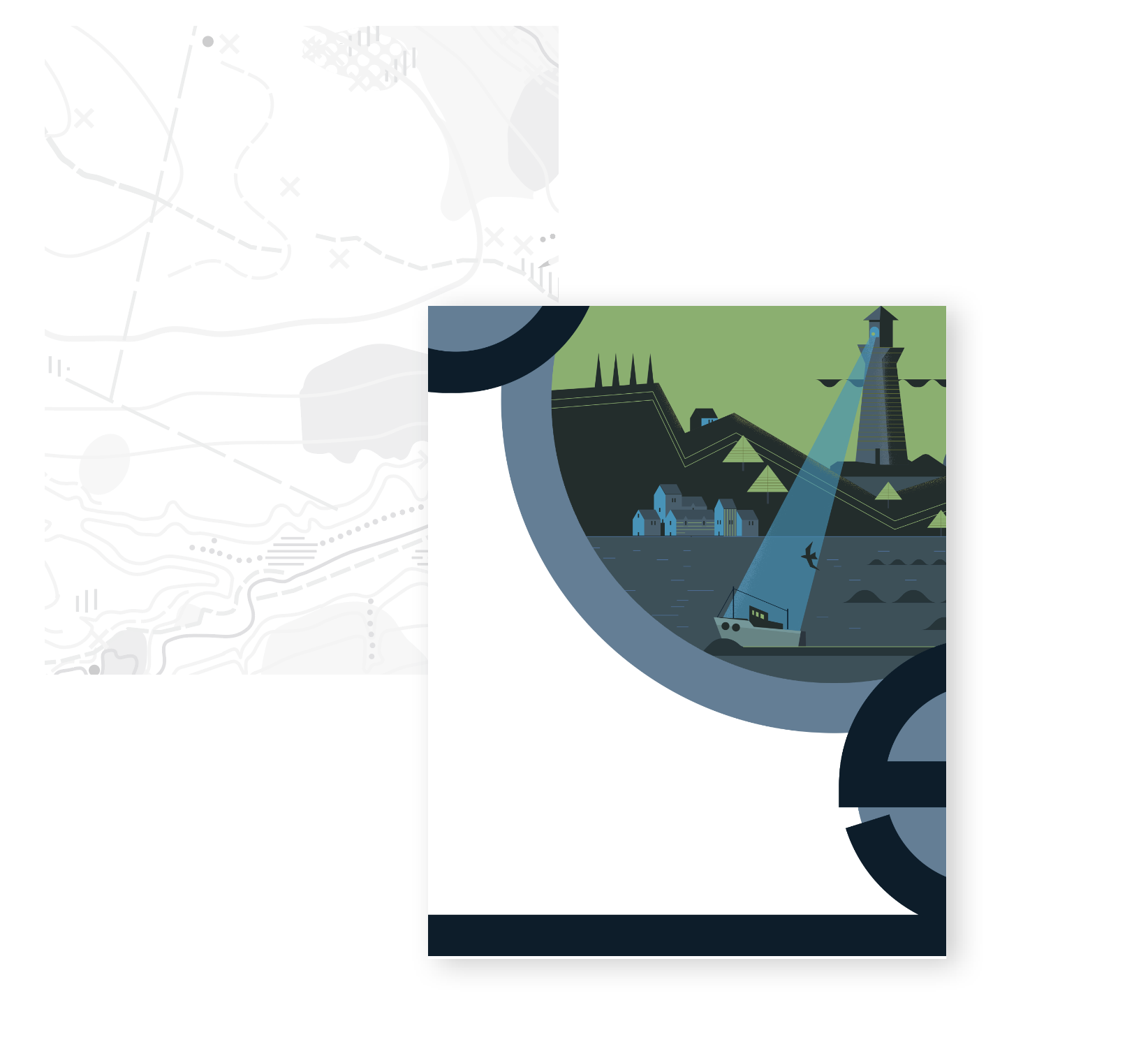
Background illustration
Topographic map
The abstract topographic map can be used to add texture and an element of interest to areas through publication and web.
Forward and reversed e
Using the graphic e and reversed e as a secondary supporting graphic can help add interest to presentations and help reinforce the brand and logo design.


Photography
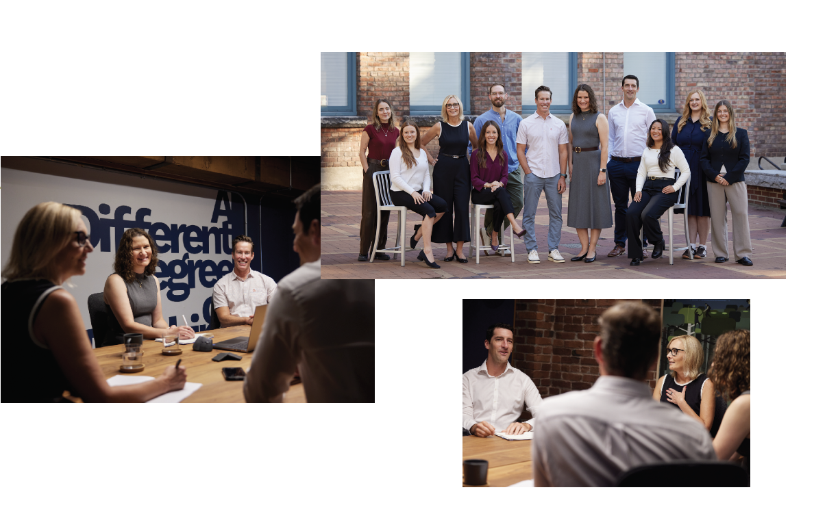
Photography will continue to play an important role in the brand. The primary shift will be toward employee-focused imagery that highlights people at work, collaborating, and engaging. This approach will emphasize smaller, team photographs that capture authentic moments and reinforce the organization’s culture. These images will be supported by photography of Vancouver and the surrounding region, helping to provide a strong sense of place and connection to the local community.
Things to avoid:
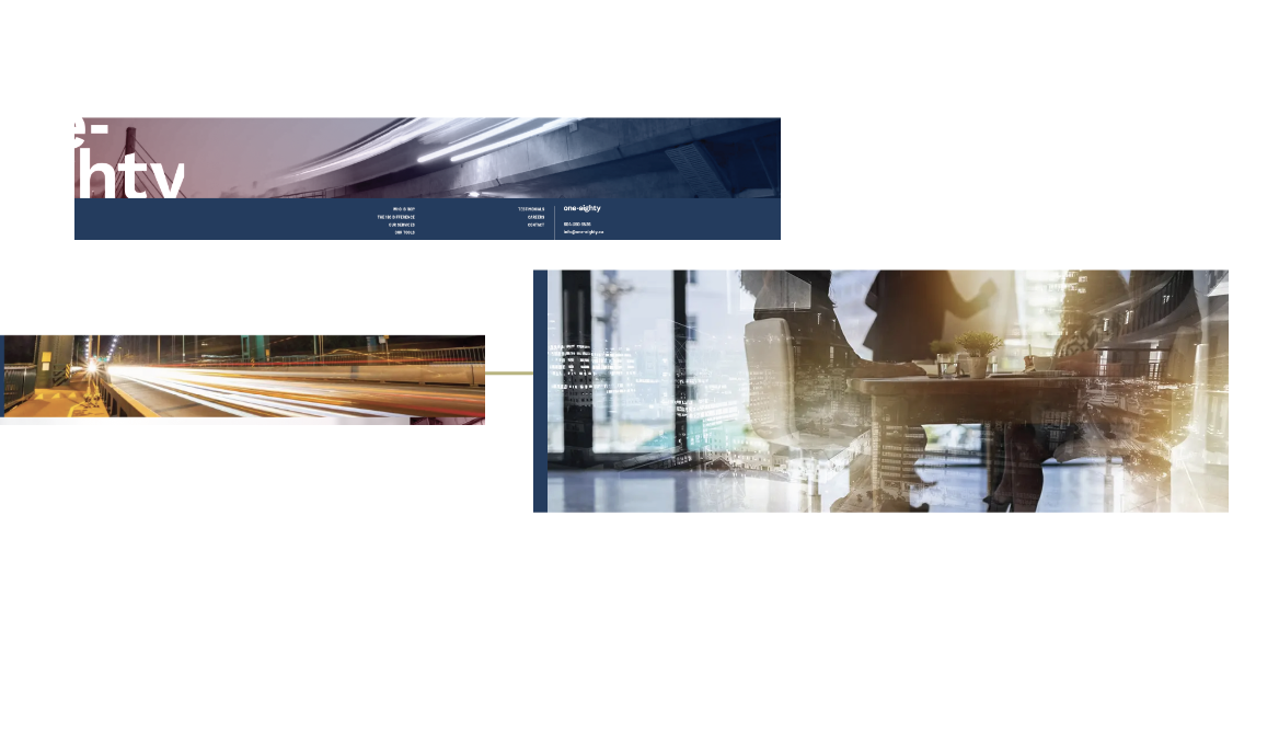
Avoid stock photography that appears dated, overly staged, or inauthentic. Heavy filters, soft-focus effects, and artificial visual treatments should be minimized. Similarly, blurred long-exposure photography, dramatic sunset imagery, overly saturated scenic photographs, and double-exposure effects do not align with the One-Eighty visual identity.
Focus on
Our people:
Employee photography helps us build a stronger, more authentic brand by putting real faces behind the organization. For recruiting, employee photos help candidates envision themselves as part of the culture, strengthening employer branding and increasing engagement with career opportunities.
Where we work:
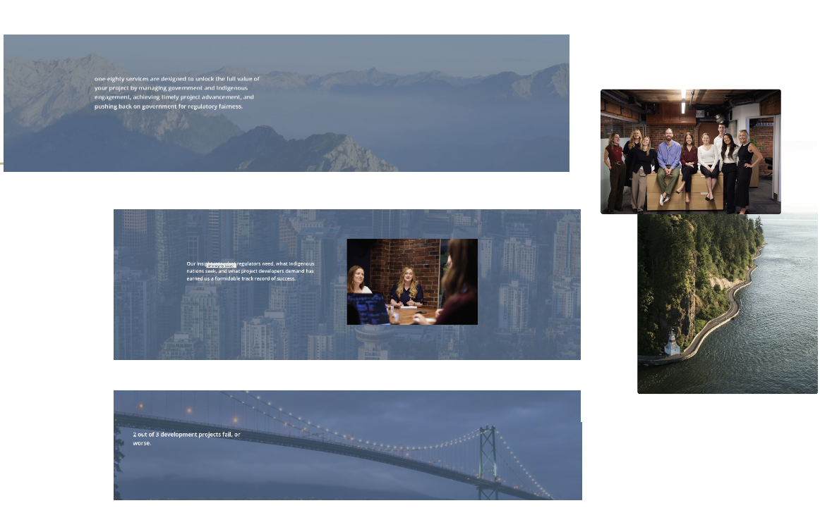
Textural cityscapes, architectural details, and landscape images may be used as supporting visuals, they help reinforce one-eighty’s local identity while conveying beauty, authenticity, and a strong connection to the community. Provided they are authentic, understated, and complement the overall
brand aesthetic.